LUNCHBOX · DESIGN DIRECTION · 17 SEPTEMBER 2026
Open up some fun.
A simple, memorable front door to the Lunchbox portfolio. Lunchbox owns the page; each app or game owns its deeper story on a separate website.
The design decision
The Studios robot is the welcome face of the combined homepage. Studios and Games remain equal sibling labels in the switch, in the product attribution, and in the short closing brand section. Full Squad has the same card size and hierarchy as Stock Brief and Grumpy Geysers.
The visual signature is the existing lunchbox itself, expanded into a large, expressive mascot. The rounded display type echoes the original hand-shaped lettering; small circles, the cross and the handle supply a restrained set of reusable shapes. Product art can have its own palette inside a consistent Lunchbox frame.
Current comparable sites
Research combines live site inspection and official page content. Observations describe what was accessible on 17 September 2026; the recommendations are design judgments, not measured conversion results.
| Reference | Observed pattern | Lunchbox application |
|---|---|---|
| Noodlecake Mobile game portfolio | Large illustrated game panels, compact game titles and product-specific store/pre-order links. News and publishing sit further down the homepage. Desktop layout visually inspected. | Make product artwork a clear route into each title. A static shelf suits this small portfolio better than its many-title carousel. |
| Supercell games Clash of Clans detail | A game index uses a brief hook for each title; the dedicated game page combines a product promise with platform download links. | Keep the portfolio promise short. Hand off to a product website for the detailed pitch and store conversion. |
| ustwo games | A coherent studio voice sits around individually recognisable game worlds, supported by descriptions, stories and studio information. | Retain the Lunchbox personality around the collection without forcing every product to look like the same app. Omit a news feed at this stage. |
| Readdle App portfolio | Parent brand navigation, individual app names and one-line benefits, with Explore App and Try it now routes. Desktop hero visually inspected. | Use a consistent product-card format and clear destination labels. Make the Studios side feel as intentional as Games. |
| Playdate Catalog Adjacent discovery reference | A distinctive platform identity, game artwork and browse routes including genres and themed collections. | Borrow the sense of a playful curated collection. With three products, extensive search and category systems would add work for visitors. |
Mobbin references and access
The public Sites index exposes hero, showcase, navigation and footer categories. Its visible entries include illustration-led, motion, and minimal references. I also visually inspected the publicly accessible Superr hero reference: chunky black type, generous light space, one tilted notebook object, and a compact primary CTA. Lunchbox applies that restraint to its own mascot and brand geometry. Shopify Design appeared in the index as Bold / Motion, but its complete flow was not inspected.
Public mobile pattern tags also include segmented controls, cards, product details and bottom sheets. The Lunchbox switch uses explicit text and an active fill; the product cards use a consistent outgoing arrow. The deeper library requires sign-in. A Mobbin login tab has been opened for the user; any additional authenticated inspection will be recorded here.
Homepage structure
- Header: the original Lunchbox wordmark, a small Studios + Games descriptor, the All / Studios / Games switch, and two anchor links.
- Brand introduction: oversized Studios mascot, one clear headline, a two-line description and an Explore the box button.
- Product shelf: three equal cards. Each contains artwork, brand, product name, one-line hook and a named outgoing CTA.
- Short brand section: the relationship between Studios and Games, using equal-size panels and their actual marks.
- Footer: Lunchbox identity. The research link and preview label are review controls and are removed for launch.
No account system, mega menu, autoplay carousel, pricing tables, newsletter form or duplicate product microsites are needed for this version.
Switching and links
All is the neutral combined view. Studios presents Full Squad and Stock Brief; Games presents Grumpy Geysers. Switching changes the hero wording, mascot and product subset within the same layout. The header and short sibling section remain present. URL query state makes each view directly linkable and browser Back / Forward works.
The production version should map each actual owned domain to its corresponding view. No domain ownership or website URL has been guessed. Each card’s final href will be the verified product website, in the same tab with a normal browser Back path. Store CTAs belong primarily to that product website. A small direct download shortcut can be added to a card after verified store listings exist.
In this review prototype, a product click opens a short destination explanation because live URLs were not supplied. This dialog is a review-only substitute for the outgoing link, not a proposed intermediate step in the public site.
CTA and monetisation system
| Context | Label / treatment | Destination |
|---|---|---|
| Homepage hero | Explore the box · black filled button | Product shelf on the same page |
| Product card | Explore Full Squad / Stock Brief / Grumpy Geysers ↗ | That product’s independent website |
| Verified live product | Download on the App Store / Get it on Google Play, using official platform badges | Exact verified store listing, optionally as a secondary shortcut |
| Not yet available | Preview product / Visit product website | Product site; no false download, rating or price claims |
The commercial job of this site is qualified traffic to the products. Product pages handle the actual offer, pricing, subscriptions or in-app purchase explanation once those models are confirmed. Measure product-card click-through by product and sibling brand; join that with product-site store clicks and verified install/purchase attribution where available. Outbound clicks alone do not prove revenue. Launch with no advertising network banners or invented performance claims.
Logo refinement
Edited the supplied Studios node 80:35 in Figma: the handle has a flat lower edge, the central cross is hidden, and two separately editable 77 × 25 rectangles with softened corners sit above the circular eyes at opposing 8° angles. An original copy is preserved at 82:2. The Games control mark is unchanged.
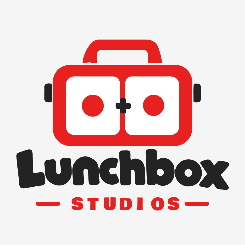
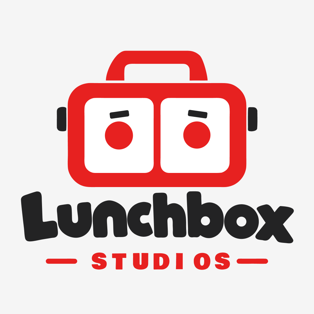
The source vectors use red #E72120 and near-black #232324. The website uses an orange #FF6A1A derivative, following the requested black/orange direction. This does not change the source-file colour. Exported originals and the refined source SVG are included in the assets folder.
Full Squad brand assets
The Full Squad tile now uses the supplied wordmark and app icon. Both SVG exports are preserved unchanged. Purple, white and cyan remain specific to Full Squad within the wider orange Lunchbox identity. The invented football-card illustration is no longer displayed.
Colour, type and components
#232324
#FF6A1A
#FFFAF2
#DDECAF
#F5DBB2
#D9C9F0
Bricolage Grotesque 800 gives large headings a compact, playful voice without replacing the actual logo. Manrope handles description and navigation text. Fonts are stored locally. Bright orange #FF6A1A is reserved for the brand artwork. Display text uses darker orange #D94C00, measured at 4.05:1 against the paper background; small text and principal controls use ink for legibility. Rounded cards echo the lunchbox shell, and white product panels echo its two face compartments.
Responsive and motion behaviour
Desktop: split hero, three-column shelf, equal sibling panels. Tablet: two-column brand area below the shelf. Mobile: compact sticky header, a full-width brand switch, stacked hero and cards, then stacked sibling panels. No content relies on horizontal dragging. Images reserve their aspect ratio to prevent layout jumps.
The prototype includes a small mascot tilt on hover, a 4% product-art zoom, a CTA lift and subtle arrow rotation. Suggested next motion pass: one quick eyebrow greeting on first arrival, then settle; a 180–220 ms switch transition can connect the robot and controller geometry. No endless bobbing, scroll hijacking or autoplay sound. Reduced-motion preferences remove transforms and smooth scrolling.
Keyboard focus is visible. Native links preserve modified-click behaviour. The review dialog uses the browser’s modal focus handling, supports Escape and returns focus to the triggering card. Touch controls are sized for direct interaction; there are no hover-only actions.
What remains before launch
Confirm the product descriptions, actual screenshots/icons, release status, product-site URLs and store listings. Full Squad now uses the supplied app icon and wordmark from Figma nodes 185:101 and 182:607, in their original colours; Stock Brief’s rising sun and Grumpy Geysers’ volcano are concept artwork based on this brief. Supply real support, privacy and company links before publication. The website is a local review prototype, not a deployed public site.
12ui was attempted but requires an account connection; the final prototype was built directly from the supplied vector assets and observed research patterns.
Back to the design ↗